When you’re “green with envy” or feeling sad and blue, you’re acknowledging a very real truth: color plays a huge role in our lives! It can turn a dull dress exciting, or a scary sky pleasant—and it can also change the way we feel in the rooms of our home. Check out some of the moods associated with these basic colors if you’re thinking about repainting.
Red: Red is traditionally used to get things stirring and fire someone up—not too surprising! The energetic color is often used in living rooms and dining rooms for this exact reason. Guests feel welcome and are eager to chat or get excited about whatever you have going on, whether it’s a home-cooked meal or a new DVD. Consequentially, it’s not always favored in bedrooms as it might be too intense for quiet contemplation.
Orange: We don’t see orange very often in interior design. Some suggest that it’s an out-of-place color, one too bright and boisterous for the house—but orange is actually a great energizer! Although it admittedly doesn’t have the familiarity or ease of red, it can get you moving in a home gym. In fact, a popular North American gym chain, Orange Theory, has walls that capitalize on just that idea!
Yellow: The happiest color of the bunch! Yellow paint can brighten up a living space, put some kick into a morning bathroom routine, and shake up a traditional kitchen backsplash. Some say the color can cause emotional outbursts, especially in young kids, as it’s certainly not the most calming hue. If you opt for yellow walls in your bedroom, for example, perhaps try for a muted or toned down shade that relaxes the eyes a bit.
Green: Green is like yellow’s cooled down, less obtrusive color cousin. It works well as a bright accent in kitchens or in paler hues in the living area or bedroom, as the color is said to spur relaxation (though bight lime green might be an exception to this).
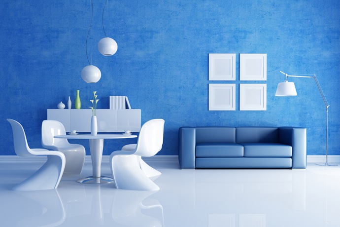
Blue: Did you know that when people feel warm, they generally respond better to cooler colors? Blue serves such a purpose. It’s often used in bedrooms to promote relaxation and a good night’s sleep, and in bathrooms to tie in with the room’s flowing water. The shade of blue matters, though—too dark and you could be feeling more sad than relaxed. When used as a wall color in a living space, be sure to add warmer accents (beige sofa, orange throw pillows, dark wood, etc.) to avoid a cold, dreary mood.
Purple: Another cool color that depends on specific shades to evoke different moods. Rich, darker purples are regal and fun, and can inspire creativity, whereas lavenders are ideal for bathrooms, bedrooms, and areas where you want to take a breath and relax.
Pink: Rich pinks—almost more like raspberry—can serve a similar purpose as purple, inspiring creativity and instilling a fun, lighthearted workspace or bedroom. As it’s a powerful color, you can reserve it for accent walls or other nooks. In any case, your best bet would probably be to save the bright, pastel, fairytale pink for little girls’ rooms.